Interaction Design Lab · MOBILE HEALTH SYSTEM
How might we help users gather & interpret their own health data?
Increasing costs and inadequate healthcare resources have created a worldwide need for more affordable diagnostic tools that are also portable, fast, and easy to use. However, research regarding patient interpretation of traditional medical tests highlights the risks in making complex health data available to a general audience. I led an iterative, user-centered design process to create a low-cost mobile health app and device.
BY THE NUMBERS
- 3result formats compared: number, natural language, chart
- 13person interdisciplinary team
- 3biomarkers tested

- DATE
- Spring 2016 - Summer 2018
- ORGANIZATION
- Interaction Design Lab
- ROLE
- ResearchDesignStrategy
- DELIVERABLES
- TEAM
- 5 Mechanical Engineers5 Information Scientists3 Nutritionists
Design Process
- 01
Problem Definition & Empathy
A prototype already existed when I joined the project, but no formal design methods had been considered. I began the design process by empathizing with users through in-lab sessions as well as formally defining the problem with our multidisciplinary stakeholders. This resulted in the first understanding of user needs and receptivity to such a system.
- 02
Online Survey
Our sessions with potential users uncovered major discomfort and confusion around interpreting health data, so we used an online survey to determine how to design our results interface so that the data could be confidently understood by users.
- 03
Design Refinement & Usability Study
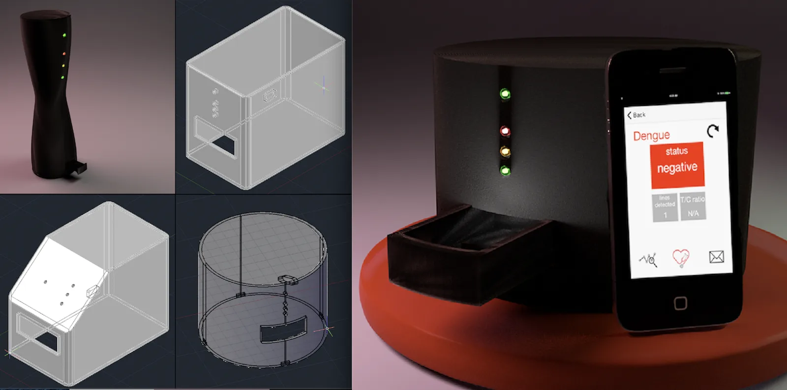
Following additional ideation, a new prototype was designed taking into account the original prototype's usability issues and design recommendations from the user survey. The new design, including hardware and a corresponding app, was a complete redesign of the original system, so we again performed usability testing.
- 04
Final Design & Usability Study
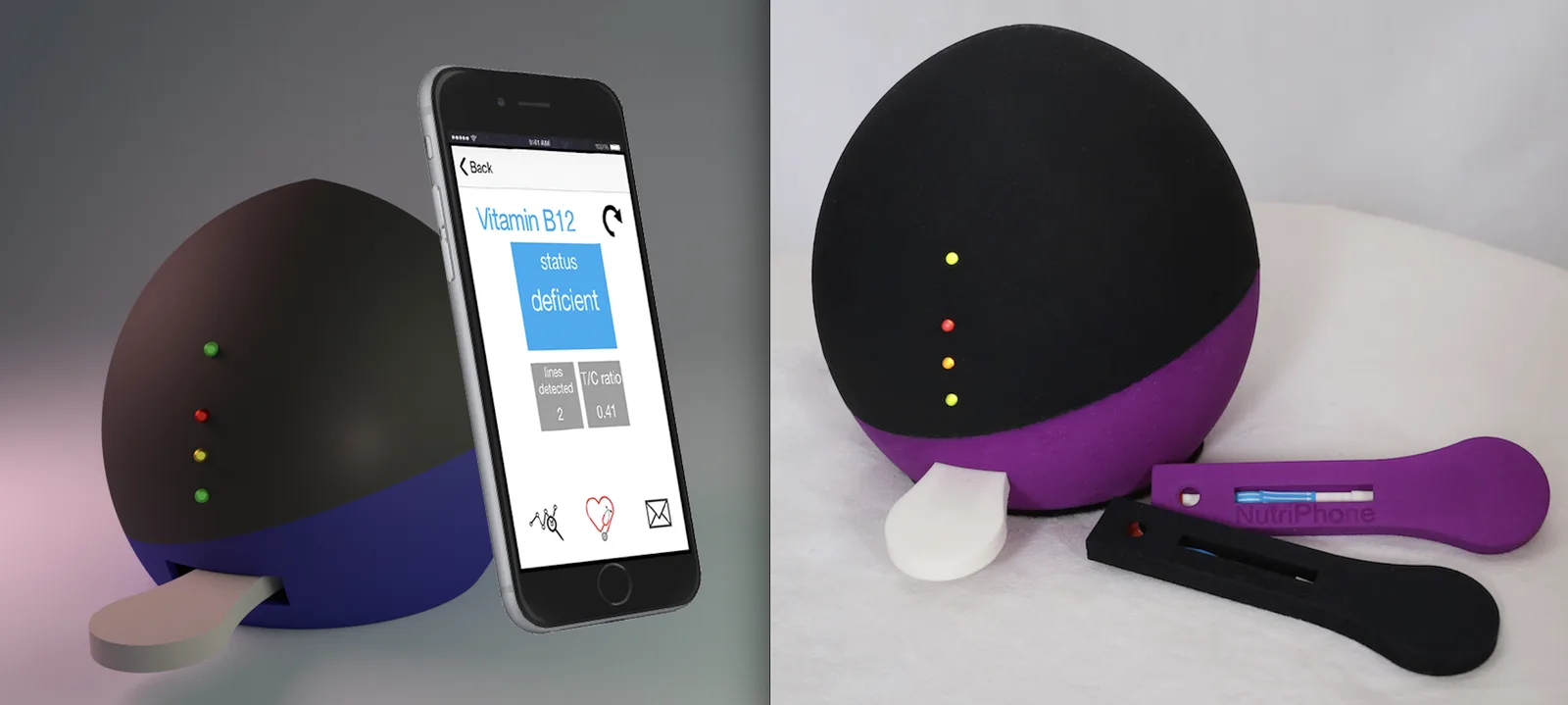
Using the new set of usability refinements and accessibility recommendations, we refined the prototype once more and performed a final round of usability testing. The resulting final design is portable, easy to use, and beneficial for a wide group of potential users, including in point-of-care contexts.
Before joining the project, no formal design processes had been used in creating the original prototype, so the initial design critique uncovered a number of issues involving:
-
Overall usability
-
Software compatibility
-
Physical specifications
-
Contamination concerns
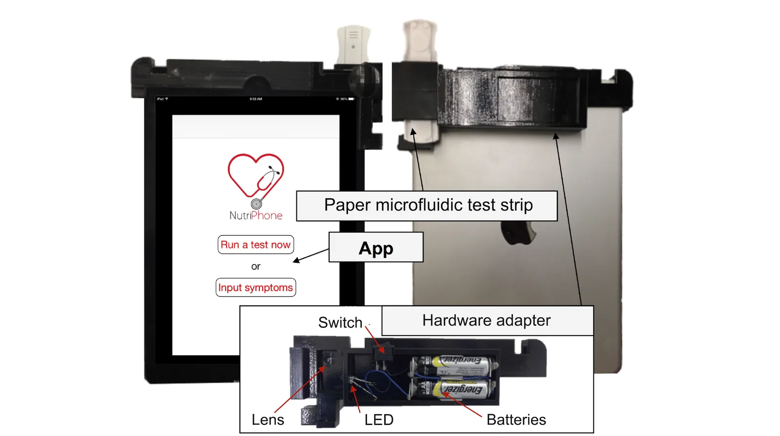
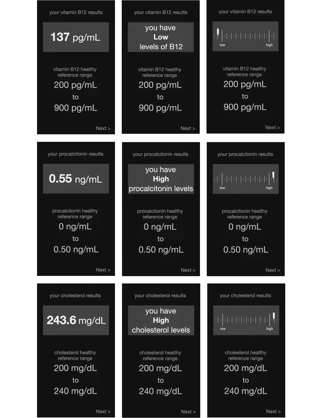
In investigating how users interpret health data, we presented hypothetical results from several blood tests via one of several designs:
-
Number representing the raw measurement of the tested biomarker
-
Natural language text indicating whether the biomarker’s level was low or high
-
Chart illustrating this level along a low-healthy axis
Design Recommendations for Mobile Health
Through our iterative design process, we uncovered design considerations that extend to the development of other mobile health technologies.
-
Adhere to the principles of universal design and accessibility.
- Make designs platform-agnostic to promote accessibility and capitalize on users' familiarity with their own devices
- Large, dark fonts on a white background was viewed as a vital element for accessibility among our diverse user population
- Large navigation buttons and straightforward, simple language aided users in progressing through the app instructions
- Visual aids (such as diagrams, photos, video) are helpful in guiding users through the procedure
-
Enjoyable operation and design may aid adoption and adherence.
-
Employ hybrid feedback designs when showing health data.
- Designs should include multiple representational modalities (numbers, words, and visuals) to tap into different literacies and increase a display's effectiveness
- If it is not possible to include multiple types of feedback in the interface (like too little space), use text-based feedback, where natural language is used to convey whether a result is “healthy,” “high,” or “low”
- Include a “healthy reference range” alongside results, especially for less familiar health indicators (such as procalcitonin)
- For tests with vital consequences, use mobile health systems as a mediator between clinician and patient
-
To encourage long-term adoption, the experience needs to bring joy
- Throughout the design process, consistently verify that users are enjoying the experience and will continue to come back